Westpac Scholars & Westpac Foundation offer grants to brilliant Australians across a variety of fields. They have created an ongoing community for the recipients that lasts a lifetime, and helps these people develop for their entire careers. We’re lucky enough to help create digital and traditional collateral for the brand, working on opportunities like the annual Westpac Scholars Summit, and creating pieces like the all important Impact Report.
We have continued to work with the Westpac Foundation for several years, and relish the opportunity to see Australia’s wealth of talent and the way Westpac continues to invest in the future.
This app received over 30,000 downloads in the first week, and charted at the number 1 position on the Australian downloads list.
The Indigemoji project inspires and empowers young people to decolonise their digital spaces, building their digital literacy and creativity.
The designs for these emojis were created over the course of 7 weeks at Alice Springs library, with the help of over 1,000 local kids. Ramen was tasked with bringing their designs into a cohesive format for use in a digital space.
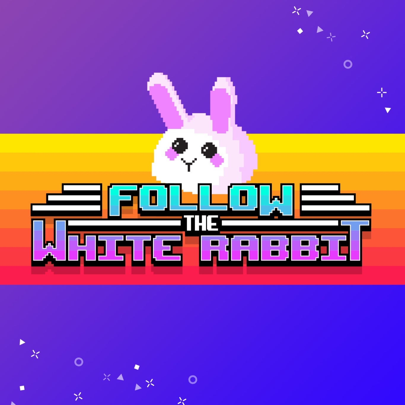
We’ve been lucky enough to work with the creative bunch over at TikTok on a variety of different opportunities. Creating the look and feel for different events has been a great way to practise some typographic love and lean into a maximal approach to colour. Across banners, microsites and other collateral, TikTok let us explore creative avenues and push ideas as far as we’d like.
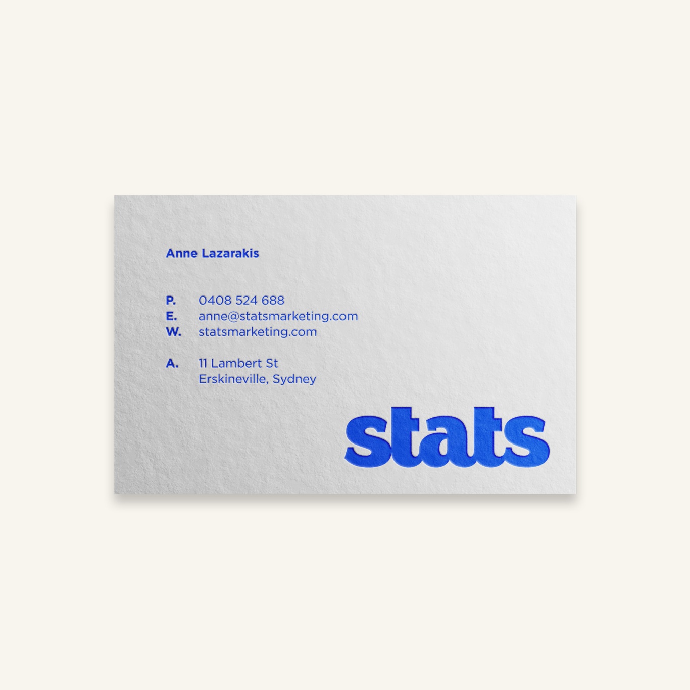
Custom lettering for our friends at Stats Marketing. This was an excellent chance to create something refined and unique for a company that eschews those values with every client interaction.
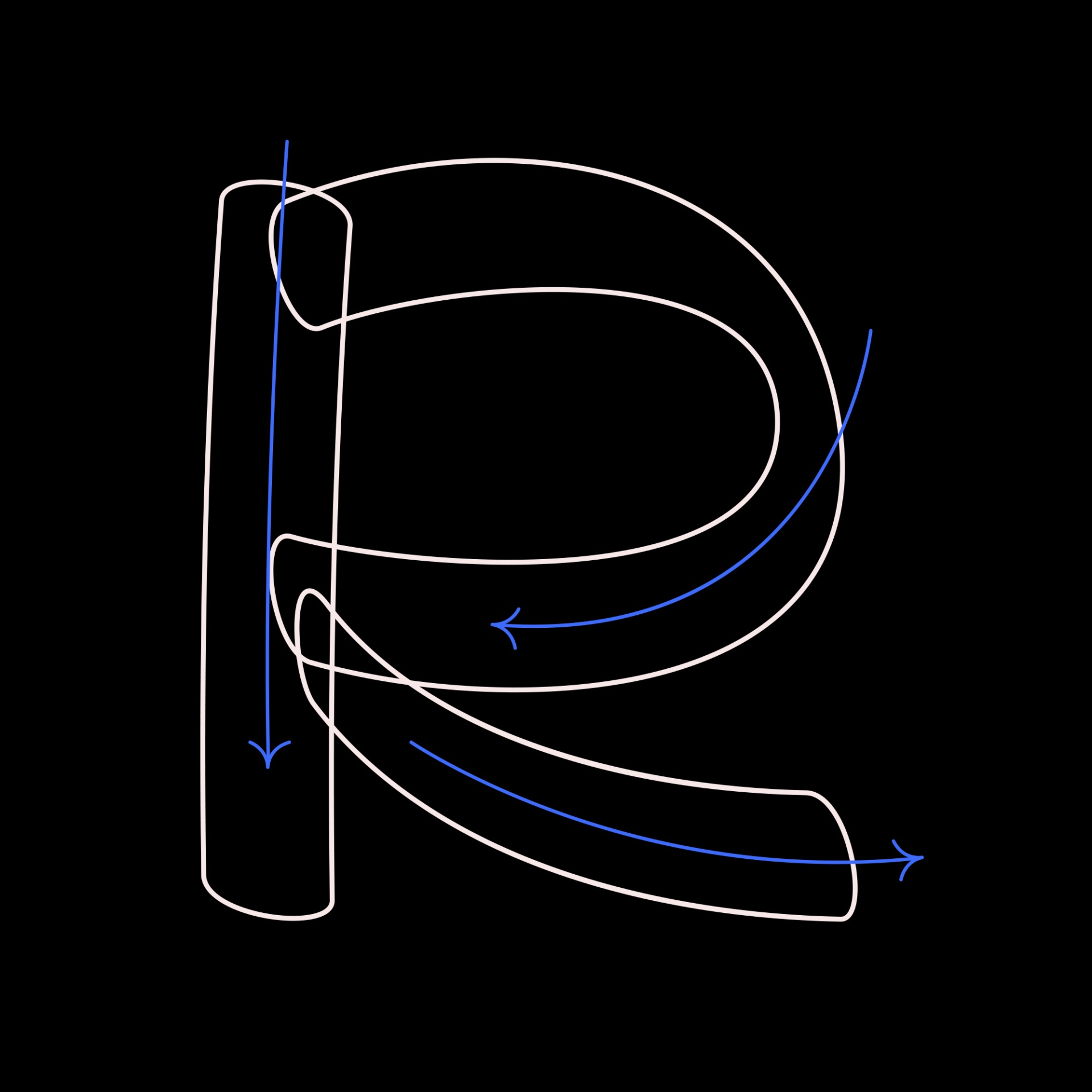
The typeface is inspired by our love of old hand-painted signs in butchers, and based on some very quick sketches using a brush pen to find what shapes worked. There is quite a quirky element to the type, as we tried to create the original sketches by rotating the brush pen to reflect the strokes of a paint brush. This lead to a horizontal stressing, which is most noticeable in letters like C, G, S and J.
Based on the simplified and unique shapes on classic Italian signage, Pina is an homage to the quirky shapes found on awnings. This font gets its name from my grandmother, Josephine, who often went by Pina.
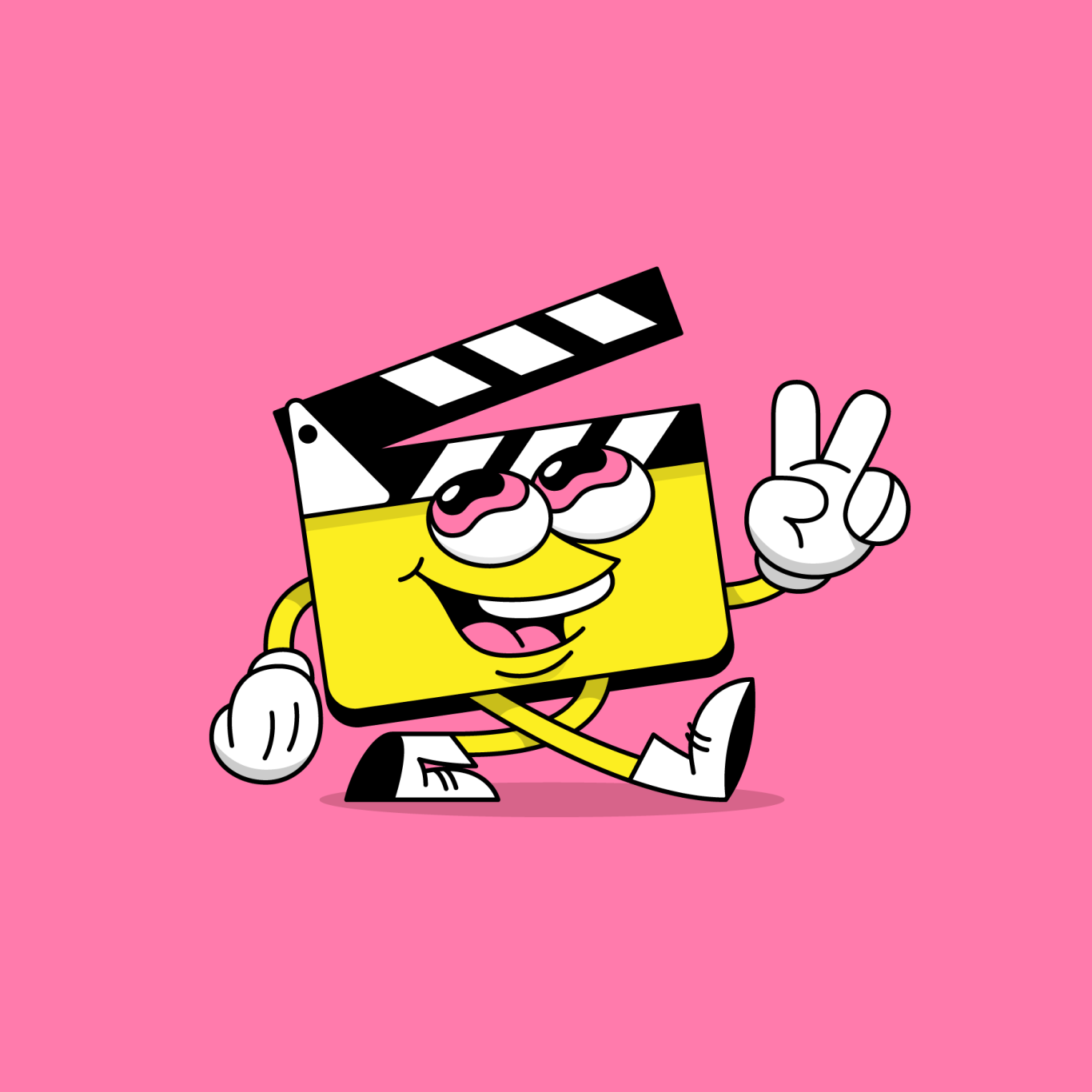
Branding and Illustration for the Sydney-based production studio, Vinewood Video. We were tasked with creating a fun, memorable character that drew inspiration from early 1930s pioneers Fleischer Studios, and their revolutionary rubberhose-style of animation.
We were approached right as the company was ready to relaunch, with the request to help shape the visual communication across every touch point. This meant reworking the existing logo into a more simplified icon that would work across every application. The brand engages with clients who are looking to move up in their lives, both personally and professionally. To reflect this, the updated icon shows both people and growth in an abstracted manner. This new brand has been applied to live events, a website, and to printed collateral.
Ramen was created out of a clear gap in the market – a full service agency that could be fast to turn around projects, while not limiting the imaginative & creative aspects.


